Metadata
- Source
- FLOE-43
- Type
- Bug
- Priority
- Major
- Status
- Closed
- Resolution
- Fixed
- Assignee
- joanna vass
- Reporter
- Michelle D'Souza
- Created
2012-07-03T14:25:24.319-0400 - Updated
2012-08-02T10:38:44.252-0400 - Versions
- N/A
- Fixed Versions
- N/A
- Component
- N/A
Description
Several things need to be fixed when high contrast themes are used in OER Commons. I'll comment and add screen shots of the issues I've found.
Attachments


Comments
-
Michelle D'Souza commented
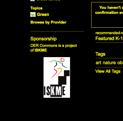
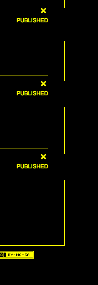
2012-07-03T14:28:58.201-0400 ISKME and Green site images should have high contrast versions.
-
Michelle D'Souza commented
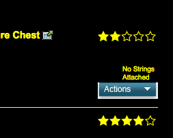
2012-07-03T14:31:11.122-0400 The actions drop down and the icon for the link to an external resource on the browse results page should have high contrast versions.
-
Michelle D'Souza commented
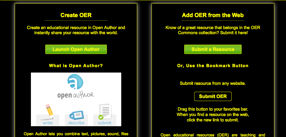
2012-07-03T14:33:53.512-0400 On the contribute page, the buttons and open author image should have high contrast versions.
-
Michelle D'Souza commented
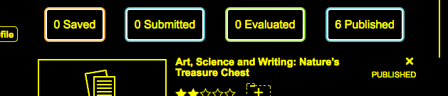
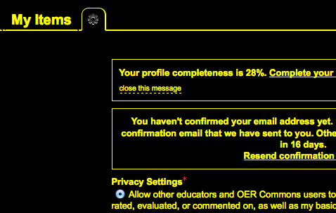
2012-07-03T14:36:58.241-0400 On the profile page, the resource summaries have coloured outlines that should conform to the high contrast theme.
-
Michelle D'Souza commented
2012-07-03T14:38:38.543-0400 The right border on the profile page is broken.
-
Michelle D'Souza commented
2012-07-03T14:40:14.535-0400 On the profile preferences page, the icon in the tab and the asterisk should follow the theme colours.
-
Michelle D'Souza commented
2012-07-03T14:41:50.225-0400 The drop down arrow beside the user name needs to have a high contrast version.
-
Michelle D'Souza commented
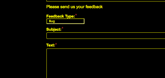
2012-07-03T14:42:41.782-0400 The asterisks on the feedback page should follow the theme colours.
-
Michelle D'Souza commented
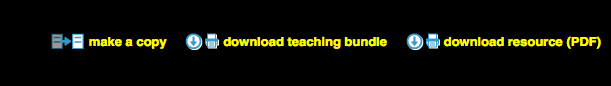
2012-07-03T14:45:29.923-0400 Icons on the resource page need high contrast versions. This includes the make a copy, download, delete and return to top icons.
-
Michelle D'Souza commented
2012-07-03T14:50:20.660-0400 On the resource summary page, the saved button and the accompanying drop down need high contrast versions.
-
Michelle D'Souza commented
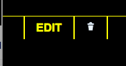
2012-07-03T14:50:58.334-0400 The edit and delete icons on the resource summary page need high contrast versions.
-
Michelle D'Souza commented
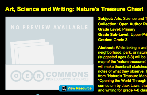
2012-07-03T14:54:30.706-0400 The preview image place holder and the view resources button need high contrast versions.
-
Michelle D'Souza commented
2012-07-16T16:25:45.738-0400 Could I get high contrast images for:
http://www.oercommons.org
1. the ISKME image
2. the arrow beside the user namehttp://www.oercommons.org/browse/general_subject/humanities
1. the arrow beside 'Actions'
2. the external resource iconhttp://www.oercommons.org/authoring/707-engineering-design-the-living-canopy/view
1. make a copy icon
2. download icon
3. return to top icon
4. trash icon
5. return to edit iconhttp://www.oercommons.org/libraries/the-adventures-of-rama
1. the drop down arrow near 'Save'
2. the folder icon when you click the above drop down arrow
3. the edit icon
4. the delete icon
5. the preview placeholder -
Anastasia Cheetham commented
2012-07-25T10:16:35.406-0400 I've attached a screenshot of the icons that become visible when an image is added to the content (in OpenAuth)). I'm not sure if that's already on your list.